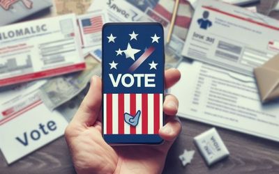
In the competitive marketplace, print insurance marketing remains a tried-and-true strategy for communicating your benefits to potential policyholders.
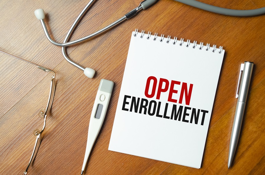
Maximizing Open Enrollment Success: 6 Key Print Materials Every Insurer Needs
Maximizing Open Enrollment Success: 6 Key Print Materials Every Insurer Needs
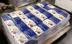
Open enrollment is a crucial time for insurance companies to attract new members and retain existing ones. In the competitive marketplace, print insurance marketing remains a tried-and-true strategy for communicating your benefits and value to potential policyholders. In this blog, we’ll explore six essential insurance print materials to maximize open enrollment success and elevate member experience.
Direct Mail Open Enrollment:
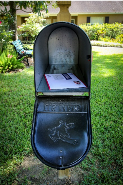
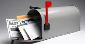
Direct mail marketing remains a powerful tool for reaching new members and reminding existing ones during open enrollment. Postcards, mailers, letters, and advertisements come in all shapes and sizes and can be used to send personalized messages, promotions, renewals, and important information about insurance plans. Direct mail allows potential policyholders the time to review and research your offerings, directly or online. With Preferred Direct’s experience and technology in direct mail services, we’ll help you create eye-catching designs with a strong call to action and targeted audience to increase your campaign ROI.
Printed Newsletters:
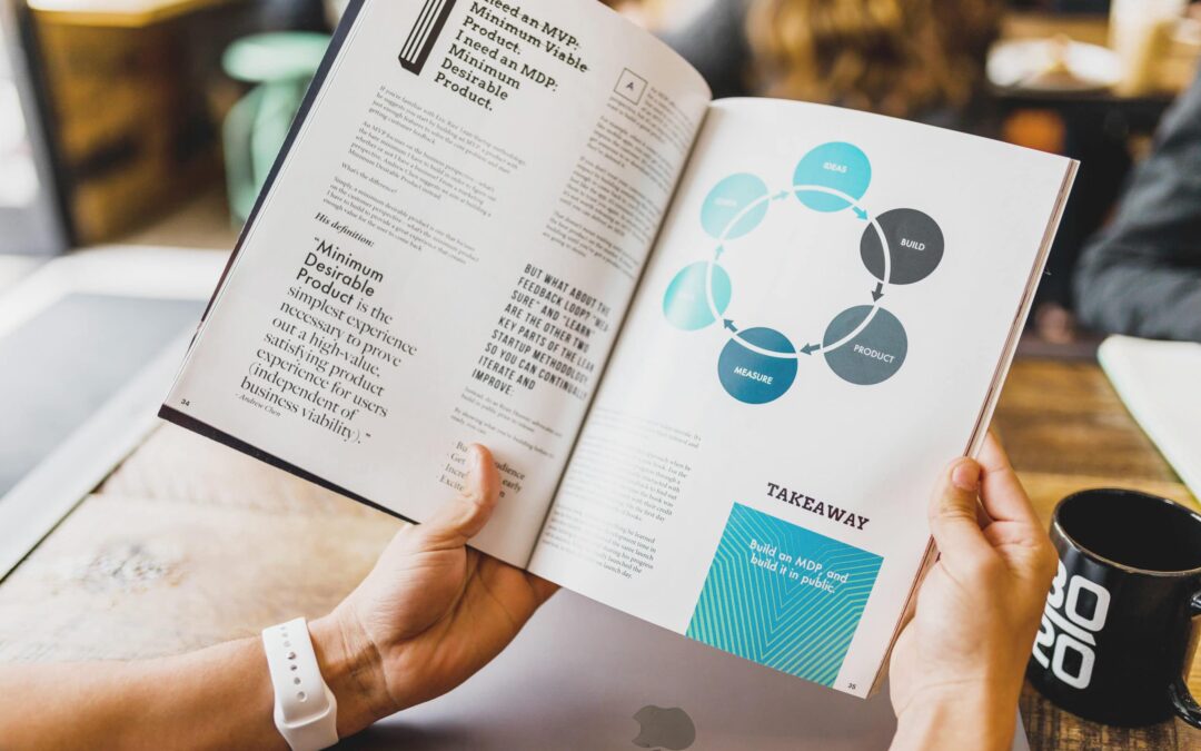
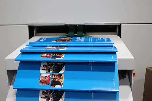
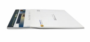 Creating a printed newsletter, with professional finishing such as saddle stitch binding, will certainly leave an impression. This print insurance marketing approach not only caters to a diverse demographic, including those who may prefer traditional communication methods but also makes it more likely to be noticed and retained. Including member benefit summaries, featured doctor and hospital news, and even a nutritional cooking recipe, can help create an engaging newsletter that establishes a tangible connection with your audience, encouraging policy enrollment and retention.
Third Party Billing:
Third-party billing can provide a seamless process for collecting premiums, deductibles, and communicating coverage details. These documents should be designed with the utmost clarity to ensure that policyholders can easily understand their financial responsibilities. Preferred Direct is a HIPAA-compliant and HITRUST-certified printer, excelling in high-quality third-party billing services. We take pride in making sure your customers have a smooth experience during open enrollment and billing because we know happy customers can equal lifetime policyholders.
Explanation of Benefits:
Explanation of Benefits (EOB) statements are essential for policyholders, providing a breakdown of the costs associated with their services. Just like third party billing, having a professional and concise EOB document and communication process will improve your member experience making them more likely to renew each year.
Member Handbooks:
Member handbooks are valuable tools for insurance companies seeking to provide their policyholders with comprehensive information about their coverage. These handbooks serve
as a go-to resource for policyholders, offering details on benefits, claims procedures, network providers, and other essential information. A well-structured member handbook can be a valuable asset for both policyholders and insurance companies during open enrollment, fostering trust and confidence in your services. With state-of-the-art printing and finishing technology, Preferred Direct can create a professionally printed and bound resource that strategically covers all your insurance offerings.
Document Printing:
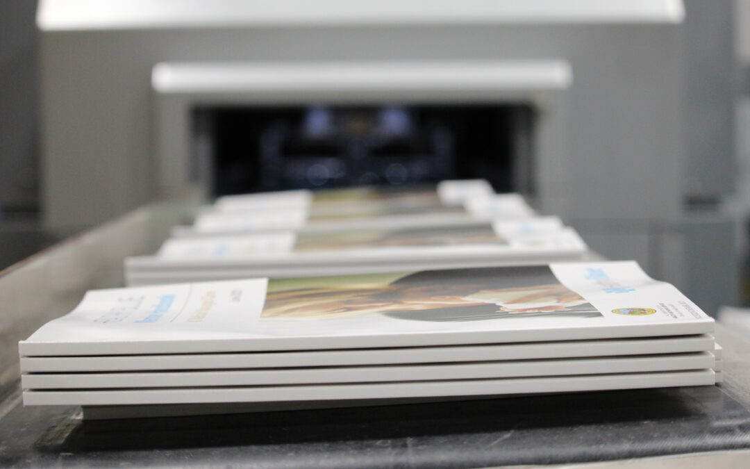
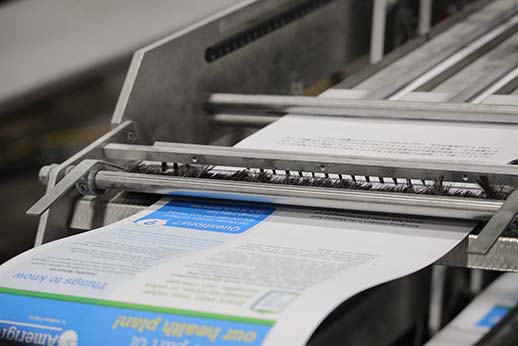
During open enrollment, insurers have a multitude of documents to print, ranging from member forms, contracts, and more. Preferred Direct offers state-of-the-art document printing services that guarantee accuracy, consistency, and professionalism. Your insurance company can rely on us to produce high-quality insurance marketing print materials that reflect your commitment to providing excellent service.
 Preferred Direct has over 35 years of experience as a second-generation family business working with insurance providers throughout the US. In our experience working with some of the largest insurance companies in the nation, to maximize success during open enrollment, it’s essential to invest in the right print materials. By incorporating third-party billing, direct mail marketing, advertising postcards, explanation of benefits, and document printing into your open enrollment strategy, you can create a comprehensive and compelling marketing campaign. These materials not only convey essential information but also reflect the professionalism and trustworthiness of your insurance company and its services.
For a successful open enrollment season, trust Preferred Direct as your full-service business communication partner. Contact us today to discuss our marketing and design services to help you goals this enrollment season.
Kickstart Your Accountant Marketing with Direct Mail
5 Pro Tips for Your Annual Company Newsletter
In the competitive marketplace, print insurance marketing remains a tried-and-true strategy for communicating your benefits to potential policyholders.
Maximizing Open Enrollment Success: 6 Key Print Materials Every Insurer Needs
In the competitive marketplace, print insurance marketing remains a tried-and-true strategy for communicating your benefits to potential policyholders.
Print-on-Demand: A Game-Changer for Economical Print
With the emergence of Print-on-Demand (POD) technology, customers now have a more economical and efficient solution for their mass printing needs.


 Direct mail is a tried-and-true method of fundraising that has stood the test of time. Its effectiveness lies in its tangible nature. Unlike
  Non-profits often deal with sensitive donor contact and financial information. It’s crucial to ensure data security and compliance with regulations like HIPAA when handling healthcare-related data. Partnering with a
  Direct mail and online fundraising can work hand in hand. Include URLs or QR codes in your materials that link recipients to online donation pages. This provides an easy and convenient way for donors to contribute, and it allows you to track the online response to your mailings.
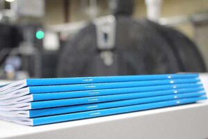
 Folding and Collating: Once the booklet pages are printed, the sheets of paper are folded to create individual pages. This folded crease is often referred to as the spine. The folded sheets are then arranged in sequential order and prepared for binding.
 Where digital marketing lacks, printed collateral thrives. Rather than creating content for the masses, print marketing campaigns are highly targeted, more memorable, and bring credibility to your business. Print marketing includes physical marketing pieces such as newsletters, catalogues, postcards,
 Builds Credibility
 Less Competition
 exposure and recall of brand information, digital marketing keeps your brand top of mind and can communicate to a broader audience.

 As a HIPAA compliant and HITRUST certified printer, Preferred Direct has invested in top print and fulfillment technology and follows the strictest data security standards to ensure the safety of your data. If you’re looking to get one step closer to ultimate HIPAA compliance, contact Preferred Direct for third-party medical bill printing and mailing services. See for yourself why Preferred Direct is the trusted health industry print partner – contact us to get started on your next print project today!
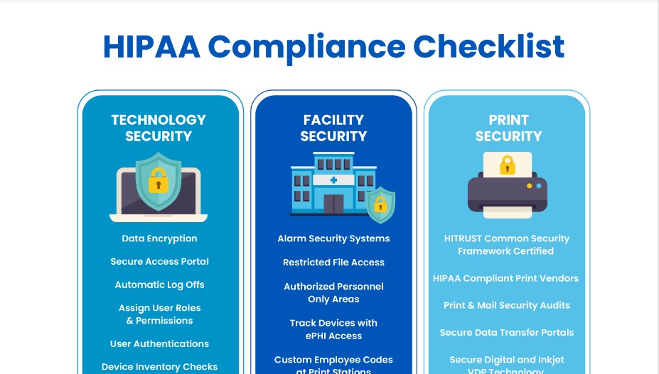
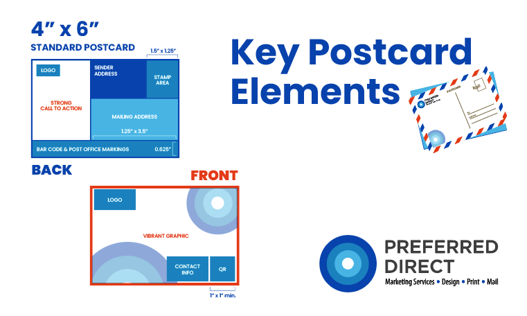
 The size of a postcard mailers plays a vital role in its impact and the recipient’s perception of your message. While there is no one-size-fits-all answer, opting for standard postcard sizes like 4″ x 6″ or 5″ x 7″ ensures cost-effectiveness and easy mailing. However, larger, or uniquely shaped postcards can help your message stand out. There is no limit to postcard size, though choose wisely.